Armoire Mobile
Increasing member engagement and retention by delivering an easy-to-use, performant mobile app
Company
Armoire Style
Timeline
6 months
Responsibilities
Project Lead
Information Architecture
UX Design
Engineering
Collaborators
Tristan Rees, CTO
Katrina Taylor, Head of UX
Ryan Baerwolf, Full-Stack Engineer
Project Overview
In response to strong user demand, I led the end-to-end creation of Armoire's mobile app. In addition to developing about 80% of its MVP feature set, I designed the app's technical architecture, devised its IA and navigation, and built its UI component library. Along the way, I learned to optimize JavaScript performance and React Native animations, and I pushed to improve existing product experiences whenever possible.
Upon successful launch, the apps quickly became the primary platform for over 75% of Armoire's user engagement. Their improved UX and native capabilities also increased user retention.


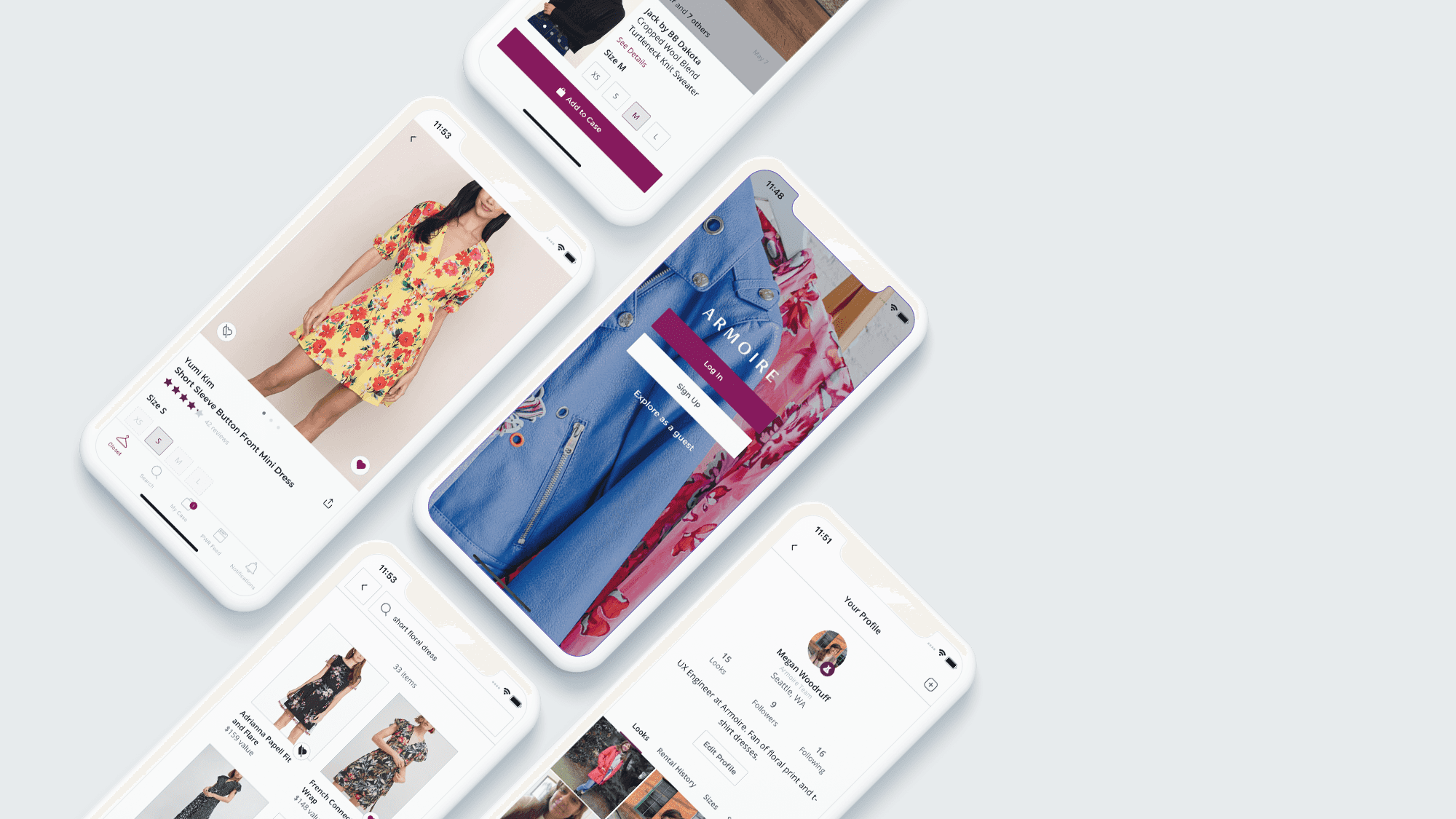
Armoire Mobile
The Armoire mobile app allows users to save, select, and rent contemporary styles from high-end brands. I built the app with React Native and released it in early April 2021 on both iOS and Android.
Note: All profile images and names shown are either my own or those of users with accounts marked explicitly as "public".
Context and Requirements
Why build an app?
Customer demand
When I conducted my first set of user interviews with Armoire members in May 2020, every single interviewee identified a mobile app as their number one ask for our tech team. This user mandate for a mobile app was clear and unrelenting across multiple customer surveys and interviews. Though Armoire's web app contained all of the core functionality needed to rent clothing, users wanted the workflow to be seemlessly integrated on their mobile devices.
Business imperative
The business case was also compelling. Key competitors in our market (Rent the Runway, Nuuly, Stitchfix) all had mobile apps. Delivering a mobile app would also unlock native-only capabilities that could increase user convenience, engagement, and ultimately, satisfaction.
| Feature Area | Required Features | Previous Experience on Mobile Web |
|---|---|---|
| Closet |
| |
| Search |
| |
| Case |
| |
| PWR Feed |
| |
| Notifications |
| |
| Account |
|


Technical Design
Investigation
My first goal was to determine an overarching framework and platform for the app's development.
As a web developer with React experience, I held a strong bias towards building Android and iOS apps using a common React Native codebase. However, with 85% of Armoire's user base on iOS, I also did not want to rule out the potential advantages of writing a native app on iOS only.
I spent the first two weeks of the project investigating the technical limitations of React Native by building a proof-of-concept prototype. I used the Expo Managed Framework to minimize development startup time and to also answer questions about the advantages and limitations of using it longterm vs a bare React Native app. The table below lists the technical considerations I weighed after two weeks of research and prototyping.
| iOS Native (Swift) | React Native | React Native + Expo Managed | |
|---|---|---|---|
| App startup speed and performance | ✅ Fastest | ⚠️ Slower than native ios app | ⚠️ Slower than native ios app |
| App bundle size | ✅ Smallest | ⚠️ Larger | ⛔ Largest. All Expo packages are required in JS bundle. |
| Native Code | ⛔ Required | ⚠️ Minimal. Primarily needed for configuring third-party packages, Push Notifications, and Deeplinks. Estimated 10% of work. | ✅ Not required. Completely abstracted away by Expo. |
| Developer Learning Curve | ⛔ Highest | ⚠️ Minimal | ✅ Lowest |
| Push Notification Support | ✅ Rich | ✅ Rich | ⛔ Minimal. Only supported through Expo Notifications Service. |
| Process for builds and submissions | ⛔ Difficult. Would need to build manually each time, or invest in third-party build and submit provider. | ✅ Easy. Can use Expo Application Services with some initial configuration. | ✅ Easiest. Can use Expo Application Services with minimal configuration. |
| Process for publishing small updates | ⛔ Time-consuming. App store submission and review required for every update. | ✅ Small updates that don’t impact JS packages can be published “over the air” with Expo, without app store review. | ✅ Small updates that don’t impact JS packages can be published “over the air” with Expo, without app store review. |
| Android app | ⛔ Out of scope | ⚠️ Supported with minimal Android-only configuration and testing | ✅ Automatically supported with no extra work. |
| Support for critical third-party packages (Stripe, Intercom) | ✅ Complete support | ✅ Near-complete support. Packages in development at time of investigation. | ⛔ Minimal. Any package that requires native configuration cannot be used. |
Proof of Concept
The proof of concept I created had a basic login screen, tab navigation, a closet screen with horizontal sliding sections, and the bones of a product details page. I also tested out image upload, state management with mobx, font customizations, and using Sass as a styling preprocessor.


Foundational UX Development
For the first month of the project, I focused on increasing the total surface area of the app by developing its information architecture and global UI components.
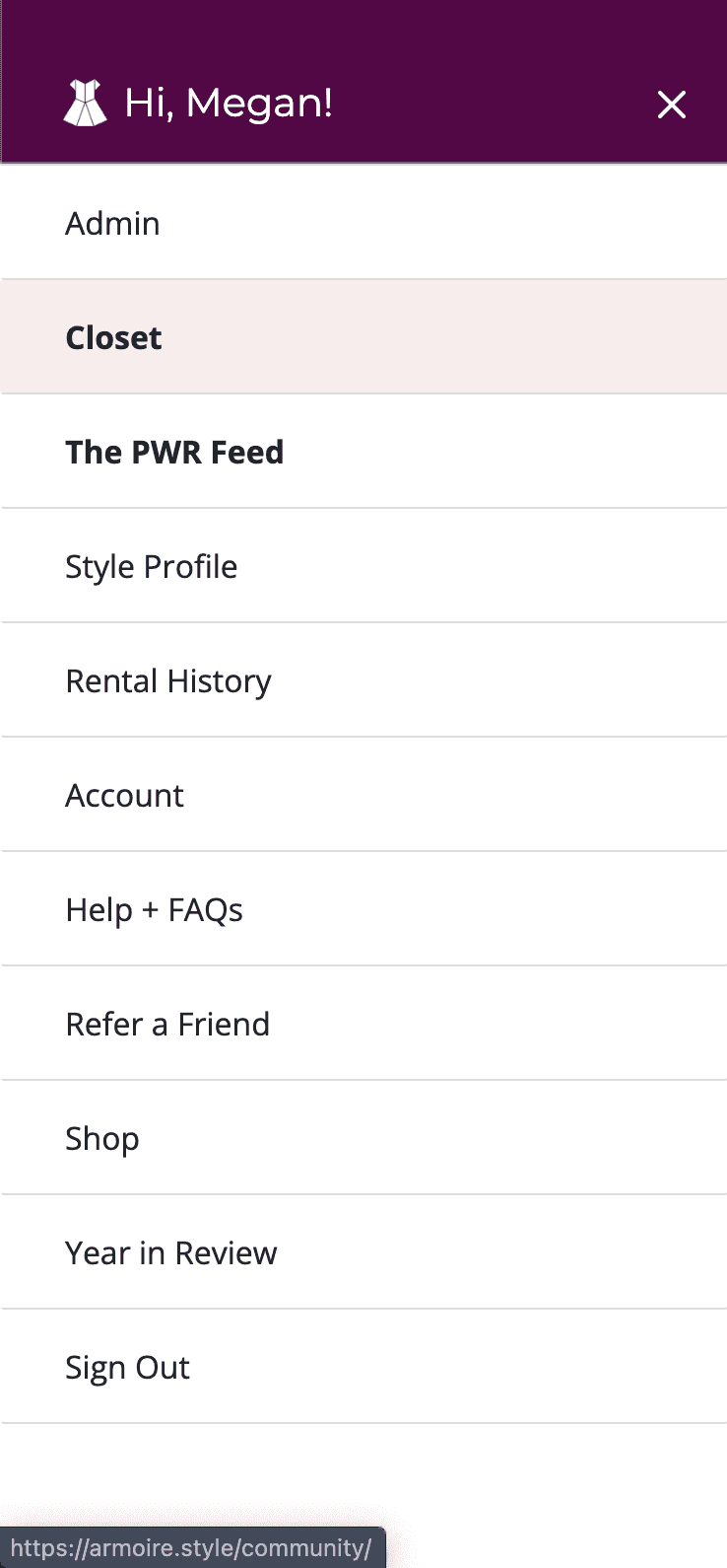
Information Architecture and Navigation
One of the first UX challenges I had to tackle was determining how to translate the existing web app’s navigation structure into a mobile app hierarchy with only 5 main tabs.


As the screen grabs above demonstrate, the existing website hierarchy was extremely flat and shallow, which didn’t lend itself well to the limited real estate of a mobile app. The diagram below represents the core sections, screens, and actions I identified in the existing web app hierarchy.
Step 1: Identify IA of web app

I realized that certain “flows”, for example, reviewing or purchasing an item, would actually be best performed without the app tab bar present, to increase user focus on the task and decrease the chance of accidentally leaving before the action is complete. Those flows are highlighted above in teal.
In the second diagram I grouped those flows together into one “Modals” object, with the idea that these screens would live outside or “on top” of the tab navigator and be opened globally throughout the app. I also moved Referrals and Style Profile within the account section, as they weren't deep enough to warrant their own section. This reduced the number of contenders for the 5 spots in the tab navigator down to 6.
Step 2: Group modals and consolidate account

From here, I worked in the opposite direction, asking: when is it most important that a user have access to the tab bar? Other than initial login, I determined that this was right after a user adds an item to their case. At this point, a user needs visual confirmation that the item was added, and an understanding of where to view their “case” of selected items.
Due to the many connections between product pages, feed items, and user profiles, 5 of the 6 remaining app areas would need to navigate to a product page. These connections are shown below, followed by an updated diagram that highlights their presence in the information architecture.

Step 3: Identify connections to product page

Since Account was the only area that didn't require deeplinking to product pages, and because its actions would be completed least often, I opted to also move it “above” the tab navigator. To make sure it would still be visible to users, I added links to it in the Closet home page, Closet section page, and Case home page headers.
Step 4: Finalize navigation + information architecture

Technical Challenges
I had never used React Native or built a mobile app prior to this project; it naturally came with a huge number of technical hurdles and learnings.
JavaScript Performance
Compared to ReactJS, one of the biggest differences I discovered in React Native was the impact of unnecessary re-renders and JS performance oversights on the usability of the app. I had to debug rigorously and implement best practices, including performance optimizers like React Native FlatList, useMemo, useCallback, and props comparison to avoid unnecessary re-renders of components. Additionally, I learned to use the React Native InteractionManager to delay the start of JS-intensive tasks until after navigation transitions completed, in order to keep the perceived performance of the app high.
React Native Flatlist was essential for creating performant product list views, as were PureComponent and useMemo. runAfterInteractions facilitated a quick transition to and from each list view, by delaying data load.
Modal screens, such as the list view filter modal, were lazy-loaded to increase transition performance. Placeholder components were rendered while loaded to decrease perceived idle time.
React Native Animations
CSS animations are not supported in React Native. To build core micro-interactions in the mobile app, I had to learn how to use the Animated framework in React Native. These animations could be offloaded to the native driver in order to keep the single-threaded JS queue clear, but in order to do so, I had to only animate native-supported properties (e.g. opacity, transform).
Working with WebViews
Certain features required using React Native Webviews to render existing web application screens or custom HTML and JS within the native app. In particular, I used Webviews to create a security-compliant native Stripe component (before Stripe released a React Native package), and to render the web version of our onboarding style quiz, which I didn't want to spend time duplicating for an app that would prioritize the needs of subscribed members.
Stripe Webview
Style Quiz Webview

Old list view (mobile web)
New list view (mobile app)
Feed product previews
In the web version of the Style Feed, users had to navigate to a product page to get basic information about a product and add it to their Case. This process of navigating back and forth between the feed and product pages was exhausting and likely decreasing user satisfaction with the feed.
In the mobile app, I added a product preview drawer that allows users to see more information about an item when they click on it, without losing the browsing context of the Feed.
Previous feed navigation (mobile web)
Feed quick view (mobile app)
Auto-selecting user sizes
Even though all Armoire users complete a 15-minute style and size quiz when signing up, that information was not always being used to save users time in the product. I added functionality to pre-select a user's size on their profile when viewing product pages and product previews.
Autoselect on product page
Autoselect on product preview
Qualitatively, Armoire users have expressed immense satisfaction with the mobile app, and many have even sent me personal "thank-yous" for the work. Quantitatively, the results are similarly encouraging.
- Members who use the mobile app in their first 30 days are 28% more likely to continue their membership after their trial, and 15% more likely to be retained month to month
- 83% of all Style Feed engagement occurs on the mobile app
- 75% of all active user engagement occurs on the mobile app
Reflection
I'm extremely proud of what I was able to produce in six months. This project required me to learn extensively, prioritize rigorously, and communicate my decisions effectively. It allowed me to flex both my engineering and UX design muscles towards an outcome that truly delighted Armoire's customer base.
Quite ironically, when this project was first pitched, I was hesitant to take the lead on it. I'm extremely grateful that my manager pushed me to do so and provided support and guidance throughout; I would not be the technologist I am today otherwise!